Try this skill in Strawberry
Most bad decks aren't badly designed. They're twenty slides of accurate material with the point somewhere on slide fourteen, and everyone in the room working out what they're supposed to think about it.
So the useful thing isn't a tool that makes slides look nice. It's one that settles what you're actually arguing first, builds from your own material rather than inventing supporting detail, and puts the conclusion where people will see it.
Agree the story before anything gets designed
The expensive mistake is building forty slides and then discovering the argument doesn't hold. So the narrative comes first: who's in the room, what they need to decide, and what a good outcome actually looks like.
You get an outline of the story and sections before any design starts, which is a much cheaper place to change your mind. Strawberry can find your brand assets and past decks in Drive or your other tools, so the deck looks like yours without you uploading a folder of logos.
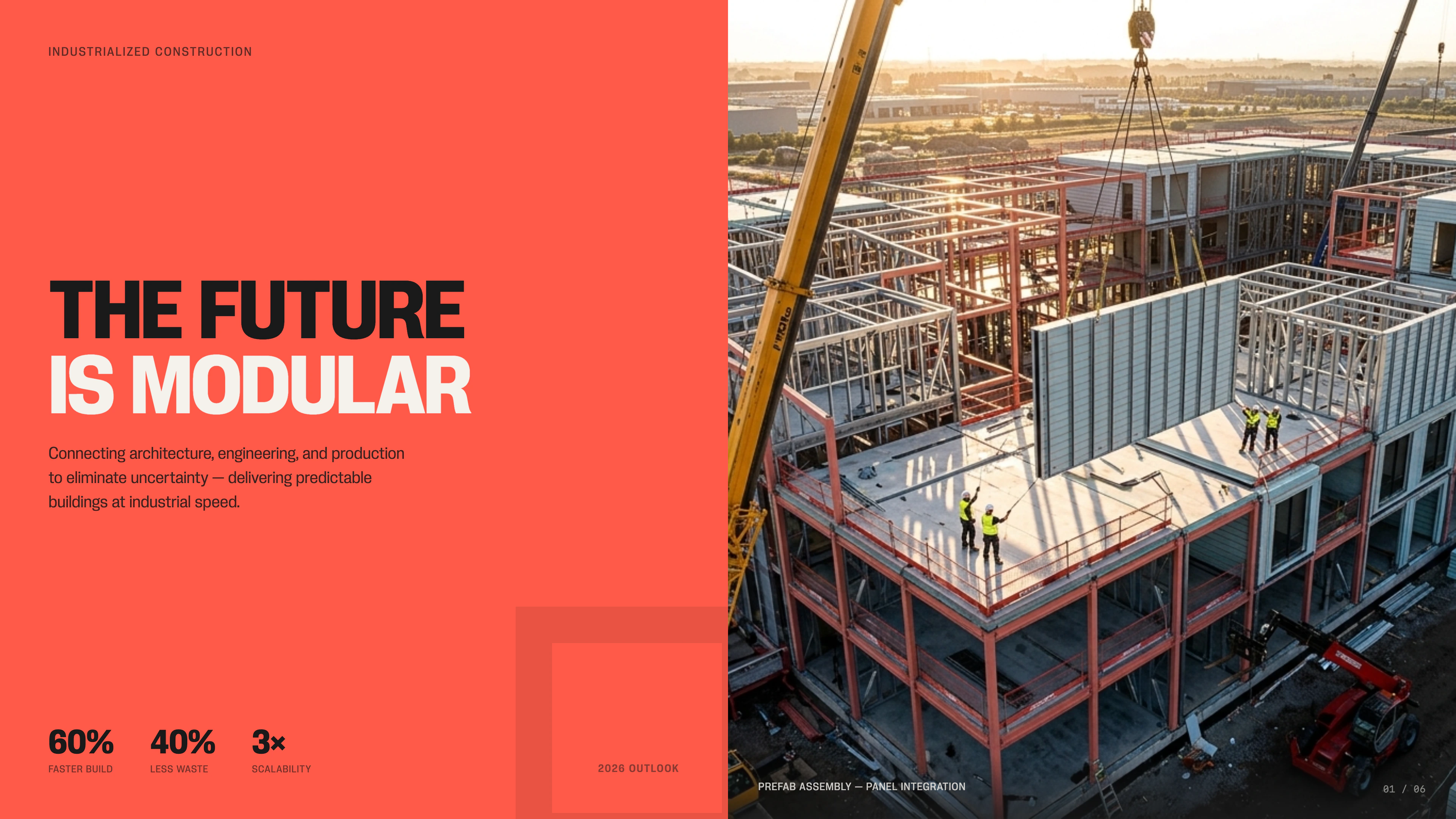
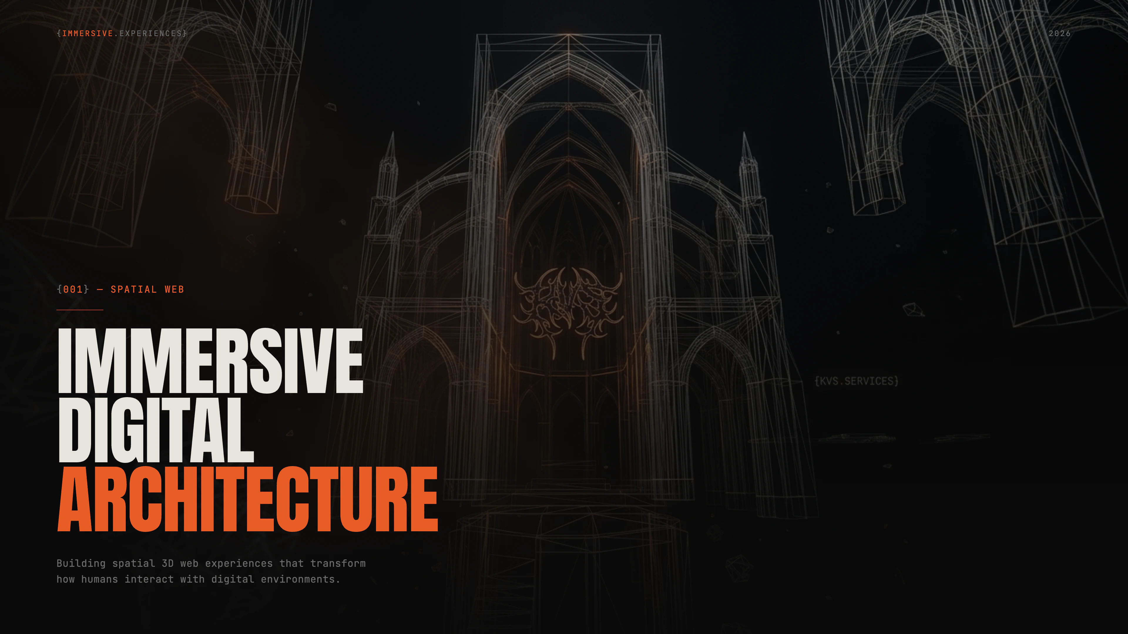

Beautiful Presentations
Create branded slide decks, posters, infographics, and dashboards based on any source on the web. Even behind login walls.
Learn moreBuilt from your material, not around it
The failure mode people worry about with AI decks is the confident slide with nothing behind it. A result nobody measured, a customer quote nobody said, a market size that sounds about right.
So claims, results, and numbers come from your own material, and where it's thin, the gap is pointed out rather than filled with a plausible-looking figure. Facts stay separate from interpretation.
For a board, investor, or client deck, the source links and dates stay attached to the claims that matter, so someone can check the slide that decides the meeting.
Lead with the finding
For anything that asks a room to decide something, the conclusion goes first and the evidence follows. Not a build-up, not a tour of the analysis. The audience should know what you think by slide two and spend the rest of the time interrogating it.
Each slide gets one job. Because Strawberry works in a real browser, it can take actual screenshots of a product, a dashboard, or a competitor's page, and generate images when nothing real fits. Charts come from the data you provided. Visuals earn their place when they land the argument harder than a sentence would.
Responding to an RFP or a proposal works differently. There the requirements get mapped explicitly to the deck, so nothing in the brief quietly goes unanswered.
Review it before it leaves the building
The finished deck gets checked for the things that embarrass you in a meeting: an argument that stops making sense in the middle, text too small to read from the back, inconsistent styling, a claim nothing supports.
Anything going to a client, board, or investor waits for your approval before it's sent. And once the structure, voice, evidence standard, and visual direction are right, they can be saved so the next deck starts from your way of doing this rather than a blank file.